Filed under: Uncategorized | Tags: 50's trend, cashiers, cellphones, cellular civility, illustrator, logos
I had abundance of fun trudging through the various layers of this project. Most of my time was spent mucking about illustrator which is why I have so many different directions as to how I envisioned everything. There are a lot of itterations which I scrapped, but I thought I would post them to show my thought process.
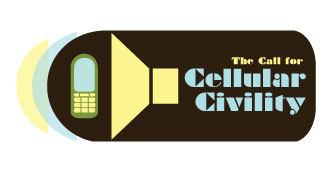
I definitely had the most fun tackling the concept of a logo. It was difficult to find a balance between clarity of text and an overall image. My intention was to capture a mood of urgency while keeping the shapes simple and clean. I really wanted to play with the purpose of each shape; this is why there are a variety of “C”‘s manipulated in various forms.

For the final logo, the “C” appears several times in the text itself, and echoes in the sound waves and even creates the shape for the megaphone. Thanks to some helpful suggestions from a friend of mine, her outside perspective allowed me to simplify the colours and eliminate the unnecessary. Suzi was also clever enough to notice the cellphone shape was very similar to the brown shape; I tweaked this aspect to duplicate the shape.
Despite my contentment with the outcome of my logo, I had a horrendous time trying to integrate the image into the poster without it looking like a last-minute insertion. There was a point where I stopped thinking and just produced.
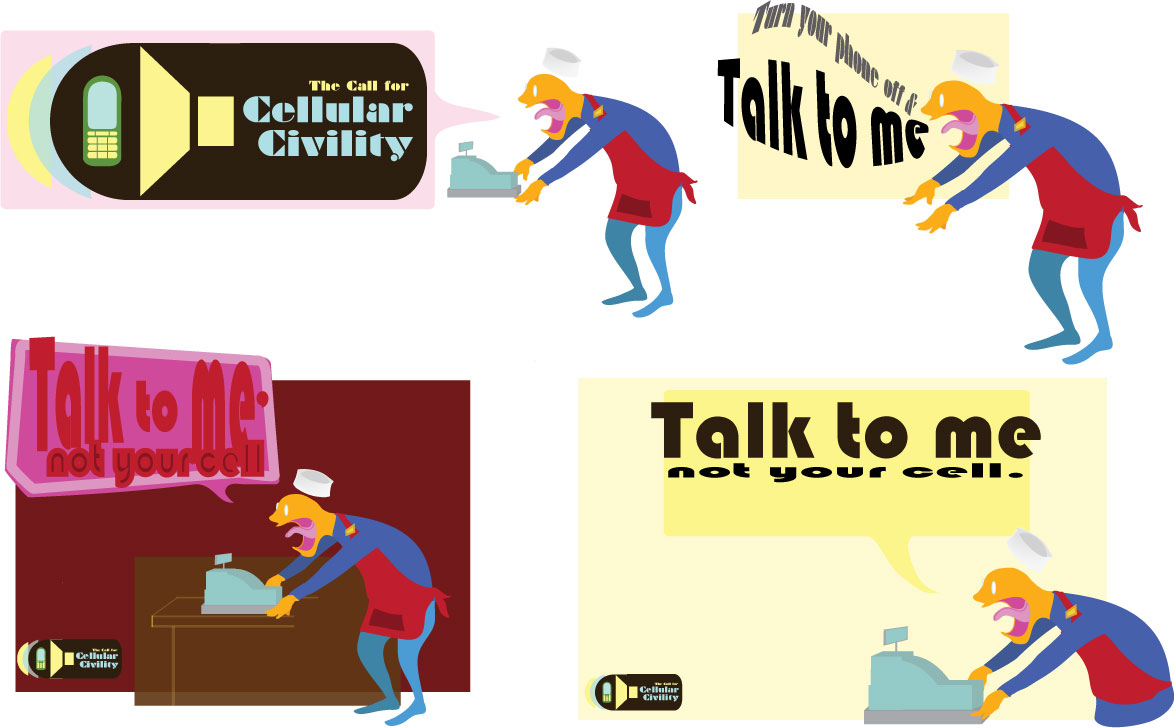
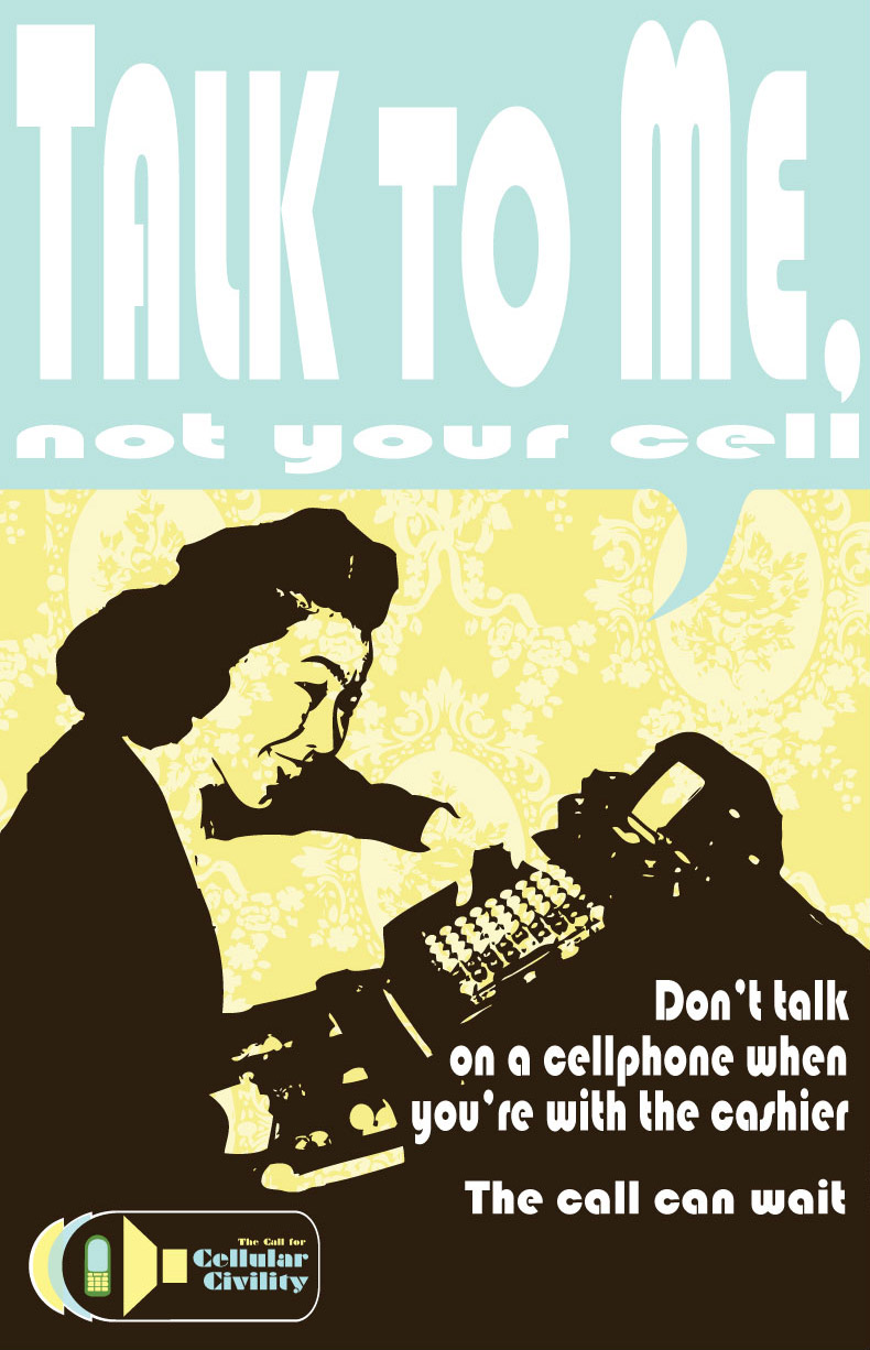
Here are the few I followed through with and printed for class today. Drawing the maddened cashier was feat in itself. I’m not a bit fan of drawing the computer- it lacks the physicality of a pen in the hand and the grit of the soft lead gracing a paper’s surface. It was fun to be a little more cartoony than I’m used to, and investigate that playfulness (especially with his little paper hat flying off with a wind of anger). At first I planned to replace his face with a giant lion’s mouth to truly capture my frustration!
I feel like him all the time.
Here is where I really tried to involv the presence of the logo, almost using it as a prop:

The crit and feedback from today’s class was extremely helpful. From there I decided to move forward with the poster which struck the dominant chord among the class. At first, I was apprehensive to go through with this poster because I thought the trend of 50’s style advertisements was a little overdone, plus I had difficulty integrating my logo. I’m very much satisfied with the outcome though! Plus, it’s an Asian cashier from the 50’s! I’m going to take some photos of this tomorrow outside my workplace.